import pandas as pd
# Import numbers as vector:
x = pd.Series((9.0, 5.4, 12.3, 6.6, 15.5, 7.0, 11.3, 6.6, 8.4, 14.4, 10.3, 13.2))Python
Here we will present some useful python commands relevant for what we want to do in Module 1.
Summarizing data in Python
In this section, we will look closer at how we can calculate these summary statistics in Python, both for a single vector of numbers and for a dataset.
A small startup tracks how many new users signed up each day (in hundreds) during a 12-day promotional campaign. The daily numbers are: \[9.0, 5.4, 12.3, 6.6, 15.5, 7.0, 11.3, 6.6, 8.4, 14.4, 10.3, 13.2\] We start by reading the data into Python:
We can find the mean by doing the calculations
\[\bar x = \frac{1}n \sum_{i=1}^n x_i = \frac1{10}(9.0+5.4+12.3+\cdots +13.2) = \frac{120}{12}=10.0.\]
or use Python:
x.mean()np.float64(10.0)The mode is the most frequent observation. This is mostly relevant for discrete observations, but in this particular example we have two observations with value 6.6, and therefore this is the mode. In Python, we would generate a frequency table and the most frequent value is the mode:
x.value_counts()6.6 2
5.4 1
9.0 1
12.3 1
15.5 1
7.0 1
11.3 1
8.4 1
14.4 1
10.3 1
13.2 1
Name: count, dtype: int64Hence, the mode is 6.6.
To find the minimum, maximum and median, we sort the numbers:
x.sort_values()1 5.4
3 6.6
7 6.6
5 7.0
8 8.4
0 9.0
10 10.3
6 11.3
2 12.3
11 13.2
9 14.4
4 15.5
dtype: float64and find the minimum value, maximum value and middle observation. The minimum is 5.4 and the maximum is 15.5. In this case, we have two observations in the middle (9.0 and 10.3). There are several ways of calculating the median in such cases. One way is to find the middle point of these two middle observations: \[\text{Median} = \frac{9.0+10.3}2 = 9.65.\] In Python, we find it by:
print("Minimum:")
print(x.min())
print("\nMaximum:")
print(x.max())
print("\nMedian:")
print(x.median())
Minimum:
5.4
Maximum:
15.5
Median:
9.65The median is middle observation. To find 1st and 3rd quartiles (25% and 75% percentiles), we find the observation that has 25% and 75% of the data smaller than itself. With 12 observations, this is sorted observation number \((12-1)*25\%+1 = 3.75\) and \((12-1)*75\% +1= 9.25\). The 25th percentile is thus between sorted observations 3 and 4, and we find it by a weighted average of the two. Since 3.75 is closer to 4, the third observation gets a higher weight. \[\text{1st quartile}=\text{25th percentile}=0.25 \cdot x_{(3)}+0.75 \cdot x_{(4)}=0.25\cdot 6.6+0.75\cdot 7.0 = 6.9.\] Likewise, \[\text{3rd quartile}=\text{75th percentile}=0.75 \cdot x_{(9)}+0.25 \cdot x_{(10)}=0.75\cdot 12.3+0.25\cdot 13.2 = 12.525\]
In Python, we find these quantities by
print("1st quartile:")
print(x.quantile(.25))
print("\n3rd quartile:")
print(x.quantile(.75))
1st quartile:
6.9
3rd quartile:
12.525A very central measure of variability in the data is the standard deviation and variance. We can find the variance of the data by \[s^2 = \frac{1}{n-1}\sum_{i=1}^n (x_i-\bar x)^2 = \frac1{11}((9.0-10.0)^2+ (5.4-10.0)^2+\cdots +(13.2-10.0)^2)=\frac{123.76}{11}=11.25\] and then find the standard deviation \(s\) by taking the square root of the variance: \[s=\sqrt{s^2}=\sqrt{15.61}=3.35.\] In Python, we find this by
print("Variance:")
print(x.var())
print("\nStandard deviation:")
print(x.std())
Variance:
11.250909090909092
Standard deviation:
3.354237482783396The inter quartile range is simply the difference between the 75th and 25th percentile of the data, which we found above. Thus \[\text{IQR}=\text{75th percentile}-\text{25th percentile} = 12.525 -6.9 = 5.625\] In Python:
# interquartile range
IQR = x.quantile(.75)-x.quantile(.25)
print(IQR)5.625Credit card dataset
Say we have a simulated data with the following variables:
- default: Binary (yes/no)
- student: Binary (yes/no)
- balance: Numeric. Balance on credict card after monthly payment.
- income: Numeric. Income of customer.
The data is from the book Introduction to statistical learning. We can load the data by:
import pandas as pd
# load the data:
default = pd.read_csv("https://raw.githubusercontent.com/holleland/TECH3/refs/heads/main/data/Default.csv",
                      sep = ";")
# Print first rows:
default.head()| id | default | student | balance | income | |
|---|---|---|---|---|---|
| 0 | 1 | No | No | 729.526495 | 44361.62507 |
| 1 | 2 | No | Yes | 817.180407 | 12106.13470 |
| 2 | 3 | No | No | 1073.549164 | 31767.13895 |
| 3 | 4 | No | No | 529.250605 | 35704.49394 |
| 4 | 5 | No | No | 785.655883 | 38463.49588 |
We can then find summary statistics for the income variable similarly to what we did above:
print("Mean income:")
print(default["income"].mean())
print("Median income:")
print(default["income"].median())

print("Standard deviation of income:")
print(default["income"].std())
Mean income:
33516.98187595744
Median income:
34552.6448
Standard deviation of income:
13336.639562731905We could also find the mode of the variable default (binary) by making a frequency table:
# Frequency of defaults
default["default"].value_counts()
default
No 9667
Yes 333
Name: count, dtype: int64Hence, “No” is the modal value of the default column.
Group by
Sometimes, we want to calculate summary statistics for different groups of data. For instance, in the dataset above, say we wanted to calculate the average income of students and non-students. In the Pandas library, there is functionality for this:
print("Mean grouped by student status: \n")
print(default.groupby("student")["income"].mean())
print("Standard deviation grouped by student status: \n")
print(default.groupby("student")["income"].std())
Mean grouped by student status:
student
No 40011.952857
Yes 17950.230775
Name: income, dtype: float64
Standard deviation grouped by student status:
student
No 10010.288665
Yes 4533.007954
Name: income, dtype: float64Thus, students have a average income of 17,950 while nonstudents have an average income of 40,012. Similarly, the standard deviations are 4533 and 10,010, respectively.
loc
It is also useful to filter the data, meaning that we select just a specific set of observations (rows). Say for instance, that we did not want to calculate the mean and standard deviation of income for both students and nonstudents, but only do it for the students. We can do this by first making a new data object that we call students, which only contains rows where the variable student is “Yes”, and the calculate the summary statistics for this new dataset. We do this, using the loc functionality:
students = default.loc[default["student"] == "Yes"]
print("Mean income of students: ")
print(students["income"].mean())
print("\nStandard deviation of student income:")
print(students["income"].std())
Mean income of students:
17950.230775053467
Standard deviation of student income:
4533.00795394927This was filtering based on a discrete (binary) variable, but we could also filter based on numerical comparisons. Say we wanted to find the average and standard deviation of income for students with a balances above 1900, and how many students have a balance above 1900? What is the maximum balance that students have in the dataset?
# Select students with balance above 1900:
students1900 = default.loc[
   (default["student"] == "Yes") & (default["balance"] > 1900)
]
print("Mean income of students with balance >1900")
print(students1900["income"].mean())
print("Income standard deviation for students with balance >1900")
students1900["income"].std()

print("\nHow many students have balance above 1900?")
print(len(students)) # number of rows

print("\nWhat is the maximum balance of a student in the data?")
print(students1900["balance"].max())
Mean income of students with balance >1900
17859.54731112371
Income standard deviation for students with balance >1900
How many students have balance above 1900?
2944
What is the maximum balance of a student in the data?
2654.322576Visualization in Python
We continue using the default dataset and load the plotting libraries matplotlib and seaborn. We also need numpy.
import matplotlib.pyplot as plt
import seaborn as sns
import numpy as np
Data visualization in Python is usually done either using the matplotlib.pyplot (plt) library or seaborn (sns). Seaborn builds on matplotlib and many may find that it is easier to get nice looking grapghics using seaborn than with matplotlib, but this may depend on your own python programming level and preferences. I often like to start out using seaborn and then use matplotlib to add features to the figure or making graphical adjustments.
Histogram
A histogram can be plotted using the matplotlib:
plt.hist(default["income"]);
plt.show(); # print figure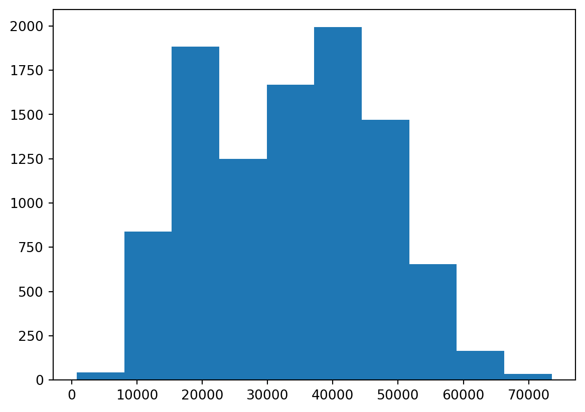
When making a histogram, the most relevant element to tweak is perhaps the bins. This can be done by either changing the number of bins or the bin width.
plt.hist(default["income"], bins = 20);
plt.show(); # print figure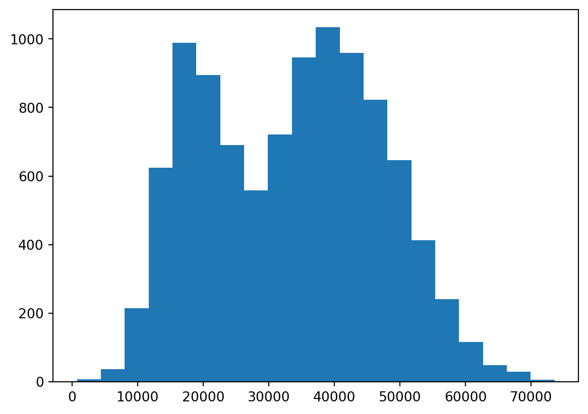
By increasing the number of bins to 20, we now see clearer the two tops in the income distribution. We can also specify the bins as a vector if we want the splits to occur at specfic locations, e.g. every 2000 dollars, by the following code.
bins = np.arange(start=0, stop=80000, step=2000)
plt.hist(default["income"], bins=bins);
plt.show();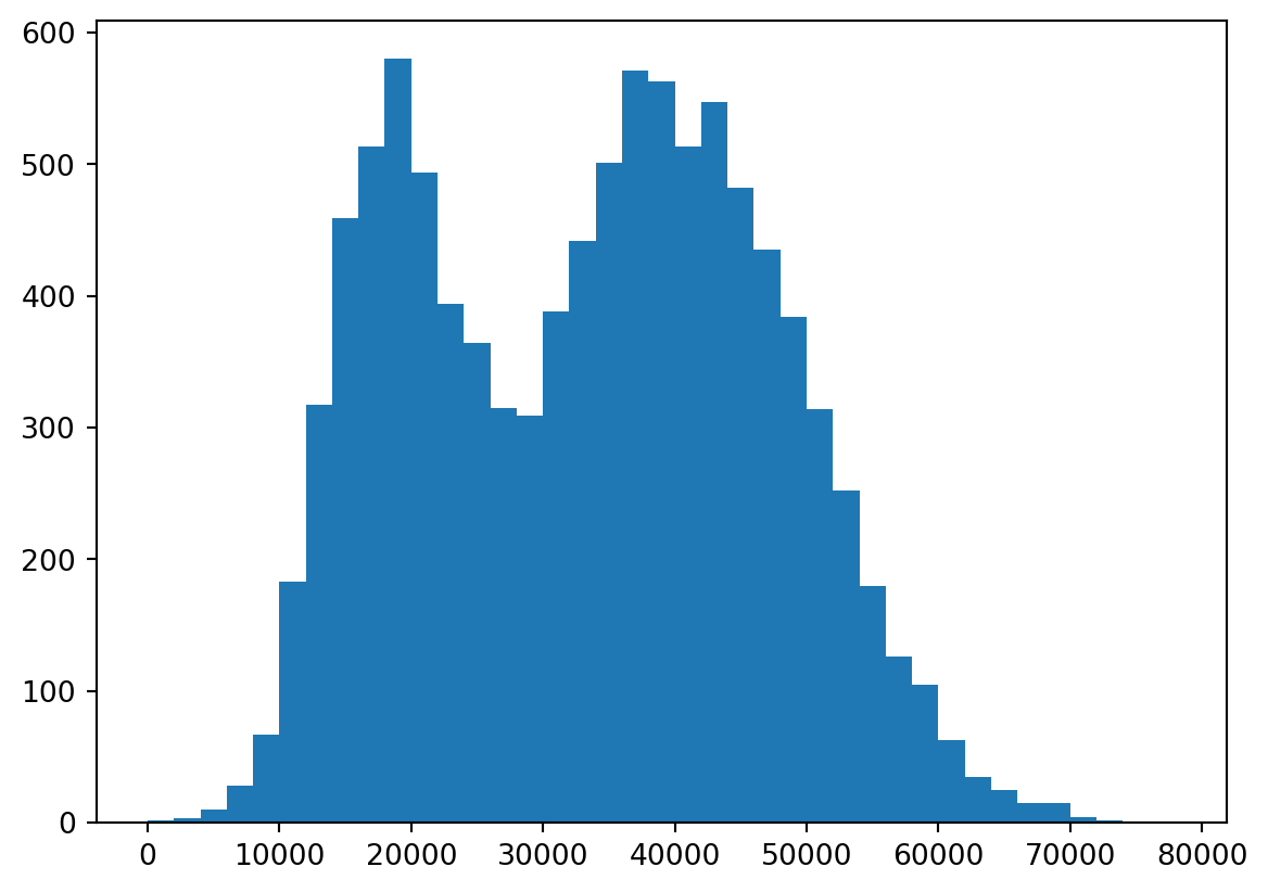
Note that the y-axis here shows the frequency of observations in each bin. It is often relevant to change this to a relative frequency instead:
plt.hist(default["income"], bins = bins, density = True);
plt.show(); # print figure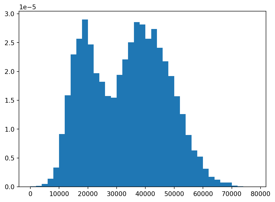
We can do this similarly using seaborn:
sns.histplot(x = "income",
             data = default,
             bins = bins,
             stat = "density");
plt.show();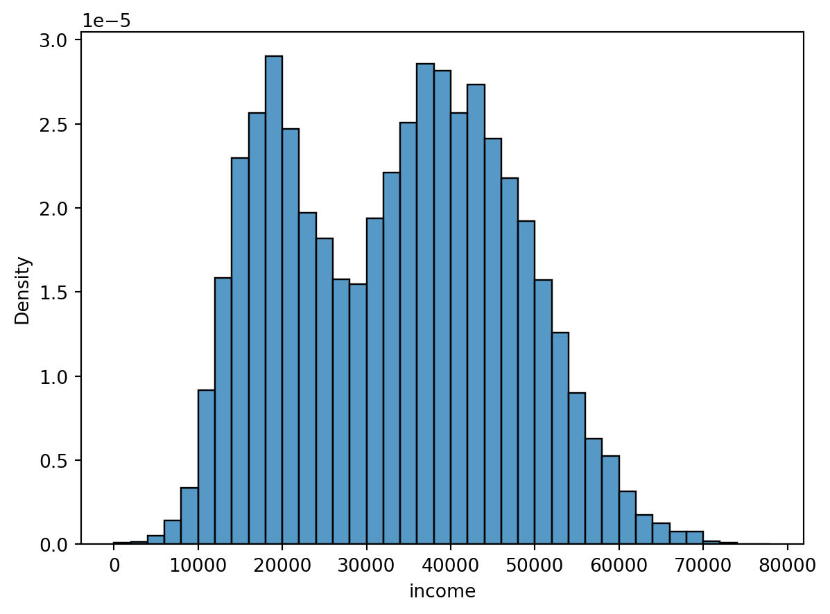
Some may prefer this syntax of feeding the function a data object and specifying which column to use for the plot. We can also add a kernel density estimate (smoothed version of a histogram) on top of the histogram by the kde argument.
sns.histplot(x = "income",
             data = default,
             bins = bins,
             stat = "density",
             kde = True);
plt.show();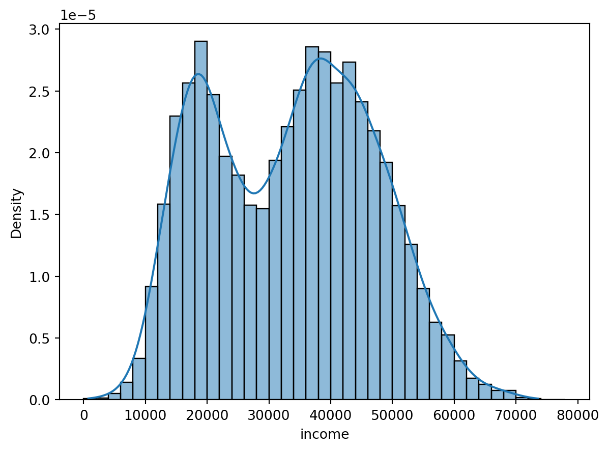
Boxplot and violin plot
Boxplot is a useful way of visualizing data.
sns.boxplot(x = "income", data = default);
plt.show();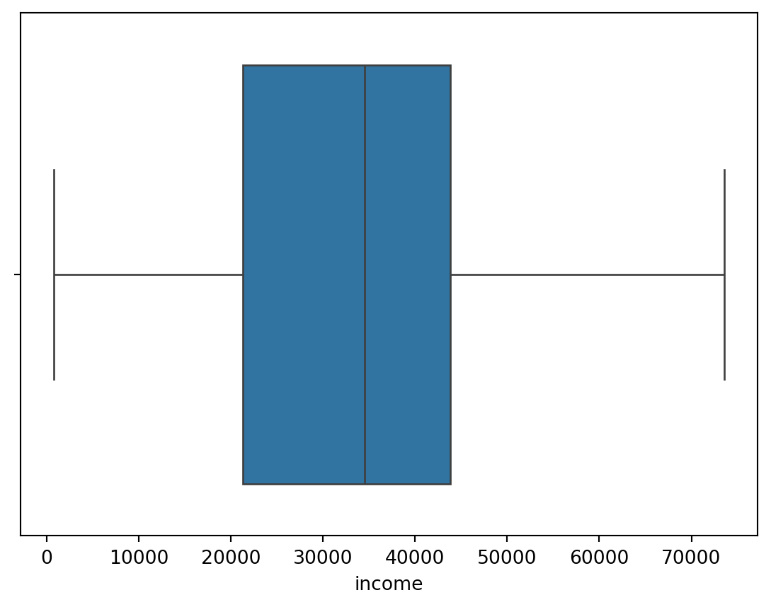
Especially, if you are going to compare a continuous variable (income) for different groups (students vs nonstudents):
sns.boxplot(x = "student", y = "income", data = default);
plt.show();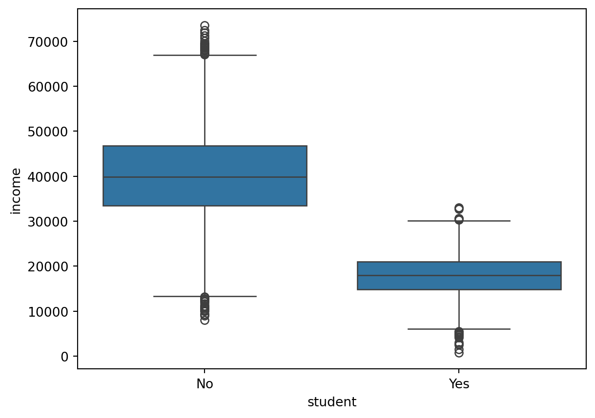
Alternatively, we can achieve the same thing using a violin plot:
sns.violinplot(x = "student", y = "income", data = default);
plt.show();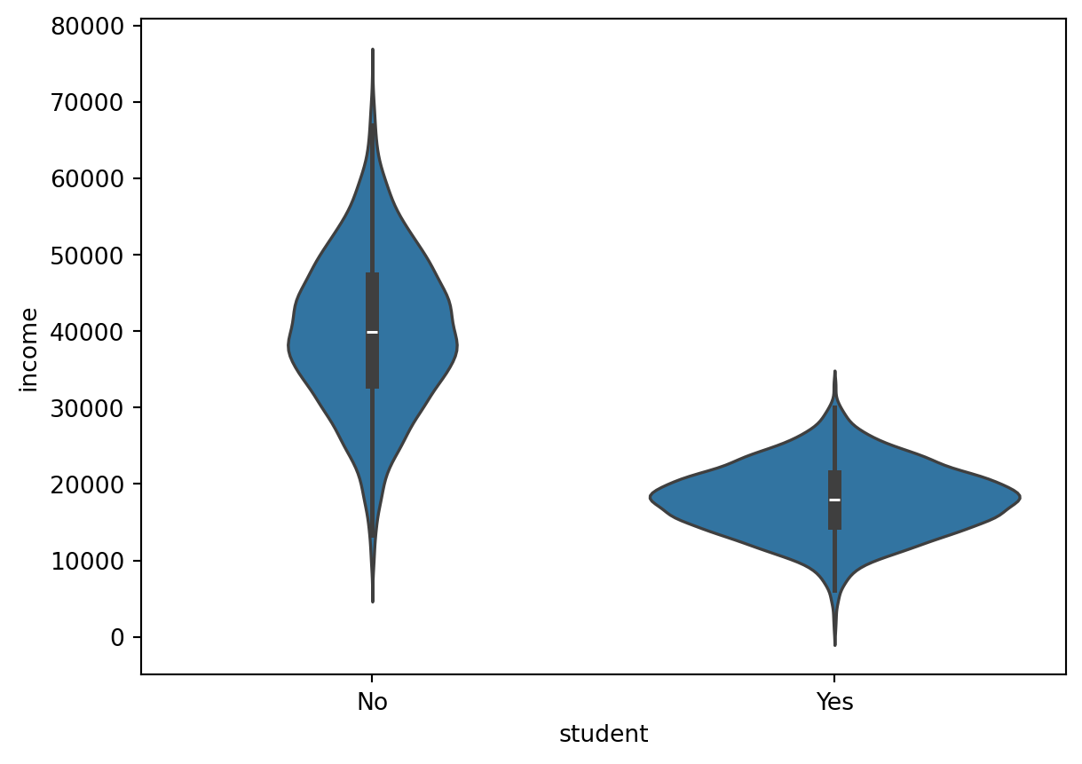
Scatterplot
Scatterplots are useful when you want to visualize the dependence structure of two continous variables, say balance and income in the default dataset.
sns.scatterplot(x="balance", y = "income", data = default);
plt.show();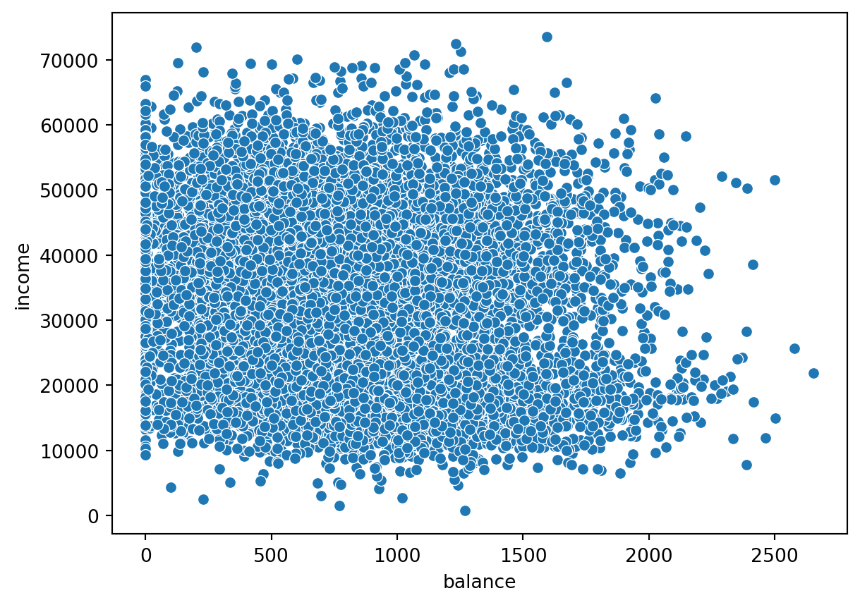
In this case, it does not seem to be a very strong relationship between the two variables.
Bar/count plot
Bar plots is a very useful way of visualizing counts or frequencies. Most graphical functions also allow you to split the plots by some grouping variable using different colors. This is done using the hue argument. In this case, we want to show the frequency of people that defaulted (default = “Yes”) or not (“No”), coloring the bars by their student status (“Yes” = student, “No” = nonstudent).
sns.countplot(x= "default",
              data =default,
              stat="proportion",
              hue = "student");
plt.show();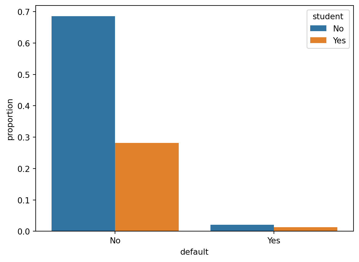
Personalize your figures!
It is important to make your graphics look good, informative and professional. The basic figure you get by using default options can be quite good, but often you may want to personalize it further. This can mean e.g. changing axis labels, adding a title, changing how the markers look, changing line widths or size of points, etc. There are lots of options you can bend and tweak when making these kinds of figures to make them look pretty and informative.
Let us use the scatterplot from above as an example. Say I want to change the axis titles:
sns.scatterplot(x="balance", y = "income", data = default);
plt.xlabel("Balance (in USD)")
plt.ylabel("Yearly gross income (USD)")
plt.show();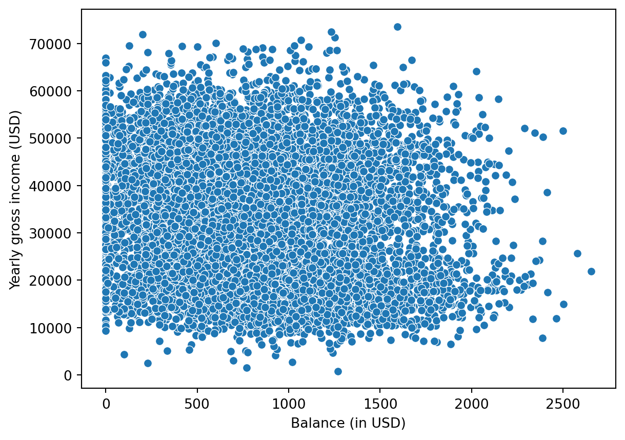
I may also want to change how the points of the scatterplot is presented:
sns.scatterplot(x="balance",
                y = "income",
                data = default,
                color = "#B5984B", # change color
                marker = "s",  # Change marker
                s=100); # Change size of points
plt.xlabel("Balance (in USD)");
plt.ylabel("Yearly gross income (USD)");
plt.show();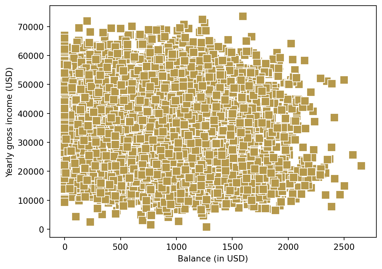
or perhaps I would like to color the points by their student status:
sns.scatterplot(x="balance",
                y = "income",
                data = default,
                hue = "student",
                marker = "x") ;
plt.xlabel("Balance (in USD)");
plt.ylabel("Yearly gross income (USD)");
plt.show();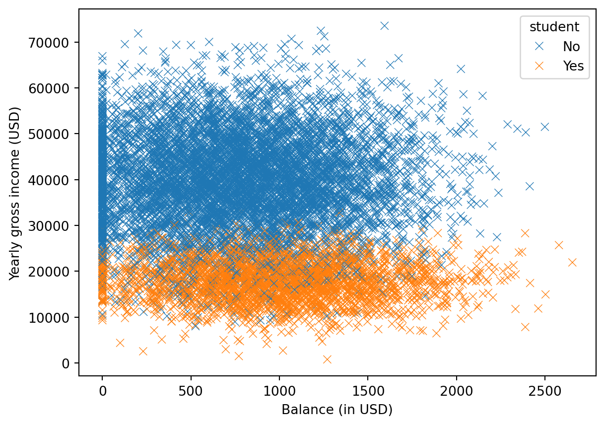
There are endless options. Check out the website for the seaborn package for more inspiration. It is also always a good idea to have a look the the help files for the functions for seeing more of the arguments you can play with when making graphics. Especially, this seaborn tutorial can be useful to have a look at.